Regression analysis: Simplify complex data relationships
This notebook demostrate knowledge of exploratory data analysis (EDA) and a binomial logistic regression model.
We will build a binomial logistic regression model and evaluate the model’s performance.
This activity has three parts:
EDA & Checking Model Assumptions
What are some purposes of EDA before constructing a binomial logistic regression model?
Model Building and Evaluation
What resources do you find yourself using as you complete this stage?
Interpreting Model Results
What key insights emerged from your model(s)?
What business recommendations do you propose based on the models built?
Build a regression model
Code
# Packages for numerics + dataframesimport pandas as pdimport numpy as np# Packages for visualizationimport matplotlib.pyplot as pltimport seaborn as sns# Packages for Logistic Regression & Confusion Matrixfrom sklearn.preprocessing import StandardScaler, OneHotEncoderfrom sklearn.model_selection import train_test_splitfrom sklearn.metrics import classification_report, accuracy_score, precision_score, \recall_score, f1_score, confusion_matrix, ConfusionMatrixDisplayfrom sklearn.linear_model import LogisticRegression
Import the dataset.
Code
# Load the dataset by running this celldf = pd.read_csv('waze_dataset.csv')
Consider the following question:
What are some purposes of EDA before constructing a binomial logistic regression model?
Outliers and extreme data values can significantly impact logistic regression models. After visualizing data, make a plan for addressing outliers by dropping rows, substituting extreme data with average data, and/or removing data values greater than 3 standard deviations.
EDA activities also include identifying missing data to help the analyst make decisions on their exclusion or inclusion by substituting values with dataset means, medians, and other similar methods.
Additionally, it can be useful to create variables by multiplying variables together or calculating the ratio between two variables. For example, in this dataset you can create a drives_sessions_ratio variable by dividing drives by sessions.
1.1 Explore data with EDA
Analyze and discover data, looking for correlations, missing data, potential outliers, and/or duplicates.
Question: Are there any variables that could potentially have outliers just by assessing at the quartile values, standard deviation, and max values?
Yes, the following columns all seem to have outliers: * sessions * drives * total_sessions * total_navigations_fav1 * total_navigations_fav2 * driven_km_drives * duration_minutes_drives
All of these columns have max values that are multiple standard deviations above the 75th percentile. This could indicate outliers in these variables.
1.2 Create features
Create features that may be of interest to the stakeholder and/or that are needed to address the business scenario/problem.
km_per_driving_day
You know from earlier EDA that churn rate correlates with distance driven per driving day in the last month. It might be helpful to engineer a feature that captures this information.
Create a new column in df called km_per_driving_day, which represents the mean distance driven per driving day for each user.
Call the describe() method on the new column.
Code
# 1. Create `km_per_driving_day` columndf['km_per_driving_day'] = df['driven_km_drives'] / df['driving_days']# 2. Call `describe()` on the new columndf['km_per_driving_day'].describe()
count    1.499900e+04
mean              inf
std               NaN
min      3.022063e+00
25%      1.672804e+02
50%      3.231459e+02
75%      7.579257e+02
max               inf
Name: km_per_driving_day, dtype: float64
Note that some values are infinite. This is the result of there being values of zero in the driving_days column. Pandas imputes a value of infinity in the corresponding rows of the new column because division by zero is undefined.
Convert these values from infinity to zero. You can use np.inf to refer to a value of infinity.
Call describe() on the km_per_driving_day column to verify that it worked.
Code
# 1. Convert infinite values to zerodf.loc[df['km_per_driving_day']==np.inf, 'km_per_driving_day'] =0# 2. Confirm that it workeddf['km_per_driving_day'].describe()
count    14999.000000
mean       578.963113
std       1030.094384
min          0.000000
25%        136.238895
50%        272.889272
75%        558.686918
max      15420.234110
Name: km_per_driving_day, dtype: float64
professional_driver
Create a new, binary feature called professional_driver that is a 1 for users who had 60 or more drives and drove on 15+ days in the last month.
Note: The objective is to create a new feature that separates professional drivers from other drivers. In this scenario, domain knowledge and intuition are used to determine these deciding thresholds, but ultimately they are arbitrary.
The churn rate for professional drivers is 7.6%, while the churn rate for non-professionals is 19.9%. This seems like it could add predictive signal to the model.
Why did you select the X variables you did?
Initially, columns were dropped based on high multicollinearity. Later, variable selection can be fine-tuned by running and rerunning models to look at changes in accuracy, recall, and precision.
Initial variable selection was based on the business objective and insights from prior EDA.
2.1 Preparing variables
Because you know from previous EDA that there is no evidence of a non-random cause of the 700 missing values in the label column, and because these observations comprise less than 5% of the data, use the dropna() method to drop the rows that are missing this data.
Code
# Drop rows with missing data in `label` columndf = df.dropna(subset=['label'])
Impute outliers
You rarely want to drop outliers, and generally will not do so unless there is a clear reason for it (e.g., typographic errors).
At times outliers can be changed to the median, mean, 95th percentile, etc.
Previously, you determined that seven of the variables had clear signs of containing outliers:
sessions
drives
total_sessions
total_navigations_fav1
total_navigations_fav2
driven_km_drives
duration_minutes_drives
For this analysis, impute the outlying values for these columns. Calculate the 95th percentile of each column and change to this value any value in the column that exceeds it.
The following are the assumptions for logistic regression:
Independent observations (This refers to how the data was collected.)
No extreme outliers
Little to no multicollinearity among X predictors
Linear relationship between X and the logit of y
For the first assumption, you can assume that observations are independent for this project.
The second assumption has already been addressed.
The last assumption will be verified after modeling.
Note: In practice, modeling assumptions are often violated, and depending on the specifics of your use case and the severity of the violation, it might not affect your model much at all or it will result in a failed model.
Collinearity
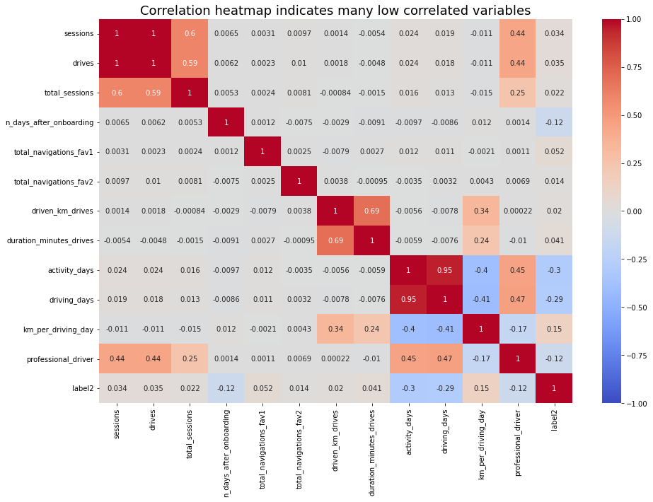
Check the correlation among predictor variables. First, generate a correlation matrix.
Code
# Generate a correlation matrixdf.corr(method='pearson')
If there are predictor variables that have a Pearson correlation coefficient value greater than the absolute value of 0.7, these variables are strongly multicollinear. Therefore, only one of these variables should be used in your model.
Note: 0.7 is an arbitrary threshold. Some industries may use 0.6, 0.8, etc.
Question: Which variables are multicollinear with each other?
sessions and drives: 1.0
driving_days and activity_days: 0.95
2.3 Create dummies (if necessary)
If you have selected device as an X variable, you will need to create dummy variables since this variable is categorical.
In cases with many categorical variables, you can use pandas built-in pd.get_dummies(), or you can use scikit-learn’s OneHotEncoder() function.
Note: Variables with many categories should only be dummied if absolutely necessary. Each category will result in a coefficient for your model which can lead to overfitting.
Because this dataset only has one remaining categorical feature (device), it’s not necessary to use one of these special functions. You can just implement the transformation directly.
Create a new, binary column called device2 that encodes user devices as follows:
Android -> 0
iPhone -> 1
Code
# Create new `device2` variabledf['device2'] = np.where(df['device']=='Android', 0, 1)df[['device', 'device2']].tail()
device
device2
14994
iPhone
1
14995
Android
0
14996
iPhone
1
14997
iPhone
1
14998
iPhone
1
3. Model building
Assign predictor variables and target
To build your model you need to determine what X variables you want to include in your model to predict your target—label2.
Drop the following variables and assign the results to X:
label (this is the target)
label2 (this is the target)
device (this is the non-binary-encoded categorical variable)
sessions (this had high multicollinearity)
driving_days (this had high multicollinearity)
Note: Notice that sessions and driving_days were selected to be dropped, rather than drives and activity_days. The reason for this is that the features that were kept for modeling had slightly stronger correlations with the target variable than the features that were dropped.
Now, isolate the dependent (target) variable. Assign it to a variable called y.
Code
# Isolate target variabley = df['label2']
Split the data
Use scikit-learn’s train_test_split() function to perform a train/test split on your data using the X and y variables you assigned above.
Note 1: It is important to do a train test to obtain accurate predictions. You always want to fit your model on your training set and evaluate your model on your test set to avoid data leakage.
Note 2: Because the target class is imbalanced (82% retained vs. 18% churned), you want to make sure that you don’t get an unlucky split that over- or under-represents the frequency of the minority class. Set the function’s stratify parameter to y to ensure that the minority class appears in both train and test sets in the same proportion that it does in the overall dataset.
Code
# Perform the train-test splitX_train, X_test, y_train, y_test = train_test_split(X, y, stratify=y, random_state=42)
Code
# Use .head()X_train.head()
drives
total_sessions
n_days_after_onboarding
total_navigations_fav1
total_navigations_fav2
driven_km_drives
duration_minutes_drives
activity_days
km_per_driving_day
professional_driver
device2
3483
50
90.468920
1039
0
15
6558.564887
1501.683515
2
0.000000
0
0
13354
45
243.720232
1480
0
35
5657.864872
4660.502879
13
471.488739
0
0
6059
48
61.511644
737
362
3
2575.235783
1407.662881
16
234.112344
0
0
198
13
186.979465
3306
184
32
905.681067
299.016399
10
90.568107
0
0
12381
2
124.305442
802
0
0
2813.451801
2021.436512
0
0.000000
0
1
Use scikit-learn to instantiate a logistic regression model. Add the argument penalty = None.
It is important to add penalty = 'none' since your predictors are unscaled.
Refer to scikit-learn’s logistic regression documentation for more information.
Fit the model on X_train and y_train.
Code
model = LogisticRegression(penalty='none', max_iter=400)model.fit(X_train, y_train)
Call the .coef_ attribute on the model to get the coefficients of each variable. The coefficients are in order of how the variables are listed in the dataset. Remember that the coefficients represent the change in the log odds of the target variable for every one unit increase in X.
If you want, create a series whose index is the column names and whose values are the coefficients in model.coef_.
Call the model’s intercept_ attribute to get the intercept of the model.
Code
model.intercept_
array([-0.00173325])
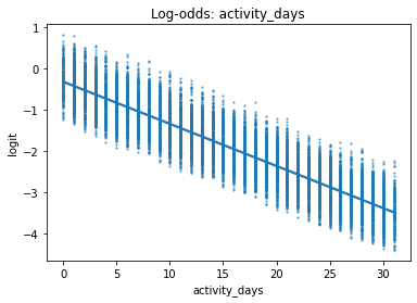
Check final assumption
Verify the linear relationship between X and the estimated log odds (known as logits) by making a regplot.
Call the model’s predict_proba() method to generate the probability of response for each sample in the training data. (The training data is the argument to the method.) Assign the result to a variable called training_probabilities. This results in a 2-D array where each row represents a user in X_train. The first column is the probability of the user not churning, and the second column is the probability of the user churning.
Code
# Get the predicted probabilities of the training datatraining_probabilities = model.predict_proba(X_train)training_probabilities
In logistic regression, the relationship between a predictor variable and the dependent variable does not need to be linear, however, the log-odds (a.k.a., logit) of the dependent variable with respect to the predictor variable should be linear. Here is the formula for calculating log-odds, where p is the probability of response: \[
logit(p) = ln(\frac{p}{1-p})
\]
Create a dataframe called logit_data that is a copy of df.
Create a new column called logit in the logit_data dataframe. The data in this column should represent the logit for each user.
Code
# 1. Copy the `X_train` dataframe and assign to `logit_data`logit_data = X_train.copy()# 2. Create a new `logit` column in the `logit_data` dflogit_data['logit'] = [np.log(prob[1] / prob[0]) for prob in training_probabilities]
Plot a regplot where the x-axis represents an independent variable and the y-axis represents the log-odds of the predicted probabilities.
In an exhaustive analysis, this would be plotted for each continuous or discrete predictor variable. Here we show only driving_days.
If the logistic assumptions are met, the model results can be appropriately interpreted.
Use the code block below to make predictions on the test data.
Code
# Generate predictions on X_testy_preds = model.predict(X_test)
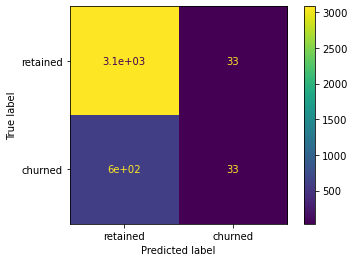
The default score in scikit-learn is accuracy. What is the accuracy of your model?
Consider: Is accuracy the best metric to use to evaluate this model?
Code
# Score the model (accuracy) on the test datamodel.score(X_test, y_test)
0.8309333333333333
4.2 Show results with a confusion matrix
Use the confusion_matrix function to obtain a confusion matrix. Use y_test and y_preds as arguments.
Code
cm = confusion_matrix(y_test, y_preds)
Next, use the ConfusionMatrixDisplay() function to display the confusion matrix from the above cell, passing the confusion matrix you just created as its argument.
You can use the confusion matrix to compute precision and recall manually. You can also use scikit-learn’s classification_report() function to generate a table from y_test and y_preds.
Note: The model has mediocre precision and very low recall, which means that it makes a lot of false negative predictions and fails to capture users who will churn.
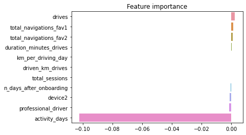
4.3 Important Features
Generate a bar graph of the model’s coefficients for a visual representation of the importance of the model’s features.
Code
# Create a list of (column_name, coefficient) tuplesfeature_importance =list(zip(X_train.columns, model.coef_[0]))# Sort the list by coefficient valuefeature_importance =sorted(feature_importance, key=lambda x: x[1], reverse=True)feature_importance
# Plot the feature importancesimport seaborn as snssns.barplot(x=[x[1] for x in feature_importance], y=[x[0] for x in feature_importance], orient='h')plt.title('Feature importance');
Conclusion
Questions:
What variable most influenced the model’s prediction? How? Was this surprising?
activity_days was by far the most important feature in the model. It had a negative correlation with user churn. This was not surprising, as this variable was very strongly correlated with driving_days, which was known from EDA to have a negative correlation with churn.
Were there any variables that you expected to be stronger predictors than they were?
Yes. In previous EDA, user churn rate increased as the values in km_per_driving_day increased. The correlation heatmap here in this notebook revealed this variable to have the strongest positive correlation with churn of any of the predictor variables by a relatively large margin. In the model, it was the second-least-important variable.
Why might a variable you thought to be important not be important in the model?
In a multiple logistic regression model, features can interact with each other and these interactions can result in seemingly counterintuitive relationships. This is both a strength and a weakness of predictive models, as capturing these interactions typically makes a model more predictive while at the same time making the model more difficult to explain.
Would you recommend that Waze use this model? Why or why not?
It depends. What would the model be used for? If it’s used to drive consequential business decisions, then no. The model is not a strong enough predictor, as made clear by its poor recall score. However, if the model is only being used to guide further exploratory efforts, then it can have value.
What could you do to improve this model?
New features could be engineered to try to generate better predictive signal, as they often do if you have domain knowledge. In the case of this model, one of the engineered features (professional_driver) was the third-most-predictive predictor. It could also be helpful to scale the predictor variables, and/or to reconstruct the model with different combinations of predictor variables to reduce noise from unpredictive features.
What additional features would you like to have to help improve the model?
It would be helpful to have drive-level information for each user (such as drive times, geographic locations, etc.). It would probably also be helpful to have more granular data to know how users interact with the app. For example, how often do they report or confirm road hazard alerts? Finally, it could be helpful to know the monthly count of unique starting and ending locations each driver inputs.