Code
import pandas as pd
import matplotlib.pyplot as plt
import numpy as np
import seaborn as snsThe idea is to conduct exploratory data analysis (EDA) on a provided dataset.
We will continue the examination of the data from the previous section and using visualizations communicate the story that the data tells.
This notebook has 3 parts:
Data Exploration and Data cleaning
Building visualizations
Evaluating and sharing results
import pandas as pd
import matplotlib.pyplot as plt
import numpy as np
import seaborn as sns# Load the dataset into a dataframe
df = pd.read_csv('waze_dataset.csv')Does the data need to be restructured or converted into usable formats?
Are there any variables that have missing data?
Answers:
The data is already in a structured format. Each row represents a user.
Yes, 700 rows have label missing. Other variables have no missing values. see section
Consider the following questions:
Given the scenario, which data columns are most applicable?
Which data columns can you eliminate, knowing they won’t solve your problem scenario?
How would you check for missing data? And how would you handle missing data (if any)?
How would you check for outliers? And how would handle outliers (if any)?
Answers:
SInce we are interested in user churn, the label column is essential. Besides label, variables that tie to user behaviors will be the most applicable. All variables tie to user behavior except ID.
ID can be dropped from the analysis since we are not interested in identifying a particular user. ID does not provide meaningful information about the churn (unless ID is assigned based on user sign-up time).
To check for missing data, we can use df.info() and inspect the Non-Null Count column. The difference between the number of non-nulls and the number of rows in the data is the number of missing values for the variable.
If the missing data are missing completely at random (MCAR), meaning that the reason for missingness is independent of the data values themselves, we can proceed with a complete-case analysis by removing the rows with missing values. Otherwise, we need to investigate the root cause of the missingness and make sure it won’t interfere with the statistical inference and modeling.
See the previous exemplar responses for the outlier question.
Use the following methods and attributes on the dataframe:
head()sizedescribe()info()df.head(10)| ID | label | sessions | drives | total_sessions | n_days_after_onboarding | total_navigations_fav1 | total_navigations_fav2 | driven_km_drives | duration_minutes_drives | activity_days | driving_days | device | |
|---|---|---|---|---|---|---|---|---|---|---|---|---|---|
| 0 | 0 | retained | 283 | 226 | 296.748273 | 2276 | 208 | 0 | 2628.845068 | 1985.775061 | 28 | 19 | Android |
| 1 | 1 | retained | 133 | 107 | 326.896596 | 1225 | 19 | 64 | 13715.920550 | 3160.472914 | 13 | 11 | iPhone |
| 2 | 2 | retained | 114 | 95 | 135.522926 | 2651 | 0 | 0 | 3059.148818 | 1610.735904 | 14 | 8 | Android |
| 3 | 3 | retained | 49 | 40 | 67.589221 | 15 | 322 | 7 | 913.591123 | 587.196542 | 7 | 3 | iPhone |
| 4 | 4 | retained | 84 | 68 | 168.247020 | 1562 | 166 | 5 | 3950.202008 | 1219.555924 | 27 | 18 | Android |
| 5 | 5 | retained | 113 | 103 | 279.544437 | 2637 | 0 | 0 | 901.238699 | 439.101397 | 15 | 11 | iPhone |
| 6 | 6 | retained | 3 | 2 | 236.725314 | 360 | 185 | 18 | 5249.172828 | 726.577205 | 28 | 23 | iPhone |
| 7 | 7 | retained | 39 | 35 | 176.072845 | 2999 | 0 | 0 | 7892.052468 | 2466.981741 | 22 | 20 | iPhone |
| 8 | 8 | retained | 57 | 46 | 183.532018 | 424 | 0 | 26 | 2651.709764 | 1594.342984 | 25 | 20 | Android |
| 9 | 9 | churned | 84 | 68 | 244.802115 | 2997 | 72 | 0 | 6043.460295 | 2341.838528 | 7 | 3 | iPhone |
df.size194987Generate summary statistics using the describe() method.
df.describe()| ID | sessions | drives | total_sessions | n_days_after_onboarding | total_navigations_fav1 | total_navigations_fav2 | driven_km_drives | duration_minutes_drives | activity_days | driving_days | |
|---|---|---|---|---|---|---|---|---|---|---|---|
| count | 14999.000000 | 14999.000000 | 14999.000000 | 14999.000000 | 14999.000000 | 14999.000000 | 14999.000000 | 14999.000000 | 14999.000000 | 14999.000000 | 14999.000000 |
| mean | 7499.000000 | 80.633776 | 67.281152 | 189.964447 | 1749.837789 | 121.605974 | 29.672512 | 4039.340921 | 1860.976012 | 15.537102 | 12.179879 |
| std | 4329.982679 | 80.699065 | 65.913872 | 136.405128 | 1008.513876 | 148.121544 | 45.394651 | 2502.149334 | 1446.702288 | 9.004655 | 7.824036 |
| min | 0.000000 | 0.000000 | 0.000000 | 0.220211 | 4.000000 | 0.000000 | 0.000000 | 60.441250 | 18.282082 | 0.000000 | 0.000000 |
| 25% | 3749.500000 | 23.000000 | 20.000000 | 90.661156 | 878.000000 | 9.000000 | 0.000000 | 2212.600607 | 835.996260 | 8.000000 | 5.000000 |
| 50% | 7499.000000 | 56.000000 | 48.000000 | 159.568115 | 1741.000000 | 71.000000 | 9.000000 | 3493.858085 | 1478.249859 | 16.000000 | 12.000000 |
| 75% | 11248.500000 | 112.000000 | 93.000000 | 254.192341 | 2623.500000 | 178.000000 | 43.000000 | 5289.861262 | 2464.362632 | 23.000000 | 19.000000 |
| max | 14998.000000 | 743.000000 | 596.000000 | 1216.154633 | 3500.000000 | 1236.000000 | 415.000000 | 21183.401890 | 15851.727160 | 31.000000 | 30.000000 |
And summary information using the info() method.
df.info()<class 'pandas.core.frame.DataFrame'>
RangeIndex: 14999 entries, 0 to 14998
Data columns (total 13 columns):
# Column Non-Null Count Dtype
--- ------ -------------- -----
0 ID 14999 non-null int64
1 label 14299 non-null object
2 sessions 14999 non-null int64
3 drives 14999 non-null int64
4 total_sessions 14999 non-null float64
5 n_days_after_onboarding 14999 non-null int64
6 total_navigations_fav1 14999 non-null int64
7 total_navigations_fav2 14999 non-null int64
8 driven_km_drives 14999 non-null float64
9 duration_minutes_drives 14999 non-null float64
10 activity_days 14999 non-null int64
11 driving_days 14999 non-null int64
12 device 14999 non-null object
dtypes: float64(3), int64(8), object(2)
memory usage: 1.5+ MBConsider the following questions as you prepare to deal with outliers:
mean() and median() of the data and understand range of data valuesThere are three main options for dealing with outliers: keeping them as they are, deleting them, or reassigning them. Whether you keep outliers as they are, delete them, or reassign values is a decision that you make on a dataset-by-dataset basis, according to what your goals are for the model you are planning to construct. To help you make the decision, you can start with these general guidelines:
Select data visualization types that will help you understand and explain the data.
Now that you know which data columns you’ll use, it is time to decide which data visualization makes the most sense for EDA of the Waze dataset.
Question: What type of data visualization(s) will be most helpful?
Answer: - Box plots will be helpful to determine outliers and where the bulk of the data points reside in terms of drives, sessions and all other continuous numeric variables
Histograms are essential to understand the distribution of variables
Scatter plots will be helpful to visualize relationships between variables
Bar charts are useful for communicating levels and quantities, especially for categorical information
Begin by examining the spread and distribution of important variables using box plots and histograms.
sessionsThe number of occurrences of a user opening the app during the month
# Box plot
plt.figure(figsize=(5,1))
sns.boxplot(x=df['sessions'], fliersize=1)
plt.title('sessions box plot');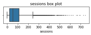
# Histogram
plt.figure(figsize=(5,3))
sns.histplot(x=df['sessions'])
median = df['sessions'].median()
plt.axvline(median, color='red', linestyle='--')
plt.text(75,1200, 'median=56.0', color='red')
plt.title('sessions box plot');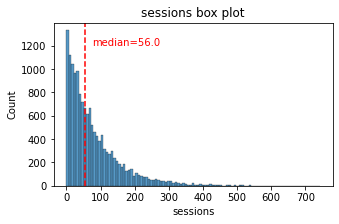
The sessions variable is a right-skewed distribution with half of the observations having 56 or fewer sessions. However, as indicated by the boxplot, some users have more than 700.
drivesAn occurrence of driving at least 1 km during the month
# Box plot
plt.figure(figsize=(5,1))
sns.boxplot(x=df['drives'], fliersize=1)
plt.title('drives box plot');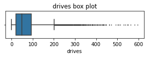
# Helper function to plot histograms based on the
# format of the `sessions` histogram
def histogrammer(column_str, median_text=True, **kwargs):    # **kwargs = any keyword arguments
                                                             # from the sns.histplot() function
    median=round(df[column_str].median(), 1)
    plt.figure(figsize=(5,3))
    ax = sns.histplot(x=df[column_str], **kwargs)            # Plot the histogram
    plt.axvline(median, color='red', linestyle='--')         # Plot the median line
    if median_text==True:                                    # Add median text unless set to False
        ax.text(0.25, 0.85, f'median={median}', color='red',
            ha='left', va='top', transform=ax.transAxes)
    else:
        print('Median:', median)
plt.title(f'{column_str} histogram');# Histogram
histogrammer('drives')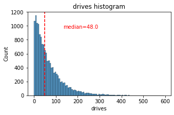
The drives information follows a distribution similar to the sessions variable. It is right-skewed, approximately log-normal, with a median of 48. However, some drivers had over 400 drives in the last month.
total_sessionsA model estimate of the total number of sessions since a user has onboarded
# Box plot
plt.figure(figsize=(5,1))
sns.boxplot(x=df['total_sessions'], fliersize=1)
plt.title('total_sessions box plot');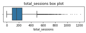
# Histogram
histogrammer('total_sessions')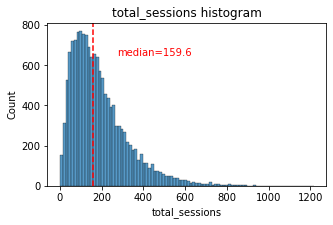
The total_sessions is a right-skewed distribution. The median total number of sessions is 159.6. This is interesting information because, if the median number of sessions in the last month was 56 and the median total sessions was ~160, then it seems that a large proportion of a user’s (estimated) total drives might have taken place in the last month. This is something you can examine more closely later.
n_days_after_onboardingThe number of days since a user signed up for the app
# Box plot
plt.figure(figsize=(5,1))
sns.boxplot(x=df['n_days_after_onboarding'], fliersize=1)
plt.title('n_days_after_onboarding box plot');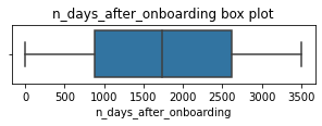
# Histogram
histogrammer('n_days_after_onboarding', median_text=False)
Median: 1741.0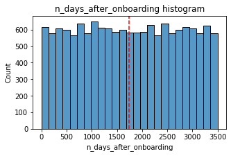
The total user tenure (i.e., number of days since onboarding) is a uniform distribution with values ranging from near-zero to ~3,500 (~9.5 years).
driven_km_drivesTotal kilometers driven during the month
# Box plot
plt.figure(figsize=(5,1))
sns.boxplot(x=df['driven_km_drives'], fliersize=1)
plt.title('driven_km_drives box plot');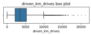
# Histogram
histogrammer('driven_km_drives')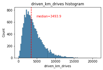
The number of drives driven in the last month per user is a right-skewed distribution with half the users driving under 3,495 kilometers. As you discovered in the analysis from the previous course, the users in this dataset drive a lot. The longest distance driven in the month was over half the circumferene of the earth.
duration_minutes_drivesTotal duration driven in minutes during the month
# Box plot
plt.figure(figsize=(5,1))
sns.boxplot(x=df['duration_minutes_drives'], fliersize=1)
plt.title('duration_minutes_drives box plot');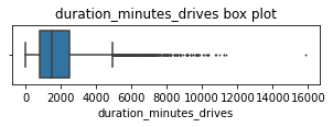
# Histogram
histogrammer('duration_minutes_drives')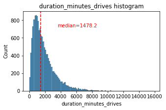
The duration_minutes_drives variable has a heavily skewed right tail. Half of the users drove less than ~1,478 minutes (~25 hours), but some users clocked over 250 hours over the month.
activity_daysNumber of days the user opens the app during the month
# Box plot
plt.figure(figsize=(5,1))
sns.boxplot(x=df['activity_days'], fliersize=1)
plt.title('activity_days box plot');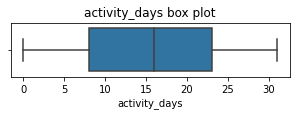
# Histogram
histogrammer('activity_days', median_text=False, discrete=True)
Median: 16.0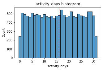
Within the last month, users opened the app a median of 16 times. The box plot reveals a centered distribution. The histogram shows a nearly uniform distribution of ~500 people opening the app on each count of days. However, there are ~250 people who didn’t open the app at all and ~250 people who opened the app every day of the month.
This distribution is noteworthy because it does not mirror the sessions distribution, which you might think would be closely correlated with activity_days.
driving_daysNumber of days the user drives (at least 1 km) during the month
# Box plot
plt.figure(figsize=(5,1))
sns.boxplot(x=df['driving_days'], fliersize=1)
plt.title('driving_days box plot');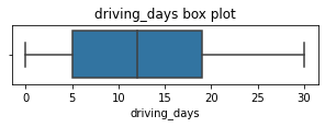
# Histogram
histogrammer('driving_days', median_text=False, discrete=True)
Median: 12.0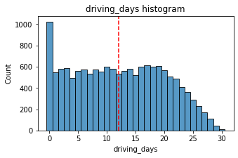
The number of days users drove each month is almost uniform, and it largely correlates with the number of days they opened the app that month, except the driving_days distribution tails off on the right.
However, there were almost twice as many users (~1,000 vs. ~550) who did not drive at all during the month. This might seem counterintuitive when considered together with the information from activity_days. That variable had ~500 users opening the app on each of most of the day counts, but there were only ~250 users who did not open the app at all during the month and ~250 users who opened the app every day. Flag this for further investigation later.
deviceThe type of device a user starts a session with
This is a categorical variable, so you do not plot a box plot for it. A good plot for a binary categorical variable is a pie chart.
# Pie chart
fig = plt.figure(figsize=(3,3))
data=df['device'].value_counts()
plt.pie(data,
        labels=[f'{data.index[0]}: {data.values[0]}',
                f'{data.index[1]}: {data.values[1]}'],
        autopct='%1.1f%%'
        )
plt.title('Users by device');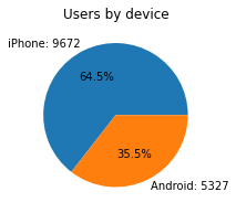
There are nearly twice as many iPhone users as Android users represented in this data.
labelBinary target variable (“retained” vs “churned”) for if a user has churned anytime during the course of the month
This is also a categorical variable, and as such would not be plotted as a box plot. Plot a pie chart instead.
# Pie chart
fig = plt.figure(figsize=(3,3))
data=df['label'].value_counts()
plt.pie(data,
        labels=[f'{data.index[0]}: {data.values[0]}',
                f'{data.index[1]}: {data.values[1]}'],
        autopct='%1.1f%%'
        )
plt.title('Count of retained vs. churned');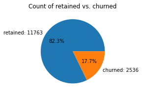
Less than 18% of the users churned.
driving_days vs. activity_daysBecause both driving_days and activity_days represent counts of days over a month and they’re also closely related, you can plot them together on a single histogram. This will help to better understand how they relate to each other without having to scroll back and forth comparing histograms in two different places.
Plot a histogram that, for each day, has a bar representing the counts of driving_days and user_days.
# Histogram
plt.figure(figsize=(12,4))
label=['driving days', 'activity days']
plt.hist([df['driving_days'], df['activity_days']],
         bins=range(0,33),
         label=label)
plt.xlabel('days')
plt.ylabel('count')
plt.legend()
plt.title('driving_days vs. activity_days');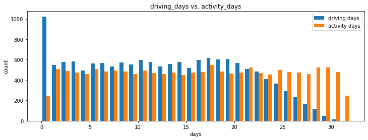
As observed previously, this might seem counterintuitive. After all, why are there fewer people who didn’t use the app at all during the month and more people who didn’t drive at all during the month?
On the other hand, it could just be illustrative of the fact that, while these variables are related to each other, they’re not the same. People probably just open the app more than they use the app to drive—perhaps to check drive times or route information, to update settings, or even just by mistake.
Nonetheless, it might be worthwile to contact the data team at Waze to get more information about this, especially because it seems that the number of days in the month is not the same between variables.
Confirm the maximum number of days for each variable—driving_days and activity_days.
print(df['driving_days'].max())
print(df['activity_days'].max())
30
31It’s true. Although it’s possible that not a single user drove all 31 days of the month, it’s highly unlikely, considering there are 15,000 people represented in the dataset.
One other way to check the validity of these variables is to plot a simple scatter plot with the x-axis representing one variable and the y-axis representing the other.
# Scatter plot
sns.scatterplot(data=df, x='driving_days', y='activity_days')
plt.title('driving_days vs. activity_days')
plt.plot([0,31], [0,31], color='red', linestyle='--');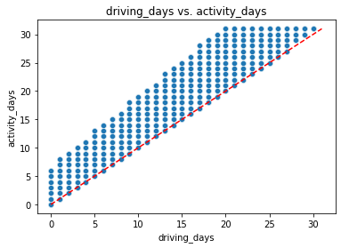
Notice that there is a theoretical limit. If you use the app to drive, then by definition it must count as a day-use as well. In other words, you cannot have more drive-days than activity-days. None of the samples in this data violate this rule, which is good.
Plot a histogram that has four bars—one for each device-label combination—to show how many iPhone users were retained/churned and how many Android users were retained/churned.
# Histogram
plt.figure(figsize=(5,4))
ax = sns.histplot(data=df,
             x='device',
             hue='label',
             multiple='dodge',
             shrink=0.9
             )
for p in ax.patches:
    ax.annotate(f'{p.get_height():.0f}', (p.get_x() + p.get_width() / 2., p.get_height()), ha='center', va='center', xytext=(0, 5), textcoords='offset points')
plt.title('Retention by device histogram');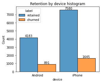
df.device.value_counts()iPhone 9672
Android 5327
Name: device, dtype: int64# Pie chart
fig = plt.figure(figsize=(3,3))
data=df['device'].value_counts()
plt.pie(data,
labels=[f'{data.index[0]}: {data.values[0]}',
f'{data.index[1]}: {data.values[1]}'],
autopct='%1.1f%%'
)
plt.title('Users by device');
The proportion of churned users to retained users is consistent between device types.
# Histogram
plt.figure(figsize=(5,4))
ax = sns.histplot(data=df,
             x='device',
             hue='label',
             multiple='dodge',
             shrink=0.9,element="bars", stat="percent"
             )
plt.title('Retention by device histogram');

#sns.histplot(data=df, x="variable", hue="category", multiple="dodge", shrink=0.8, element="bars", stat="count")

# Display counts on the top of the bars
for p in ax.patches:
    ax.annotate(f'{p.get_height():.0f}', (p.get_x() + p.get_width() / 2., p.get_height()), ha='center', va='center', xytext=(0, 5), textcoords='offset points')

plt.show()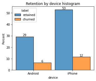
In the previous course, you discovered that the median distance driven per driving day last month for users who churned was 608.78 km, versus 247.48 km for people who did not churn. Examine this further.
Create a new column in df called km_per_driving_day, which represents the mean distance driven per driving day for each user.
Call the describe() method on the new column.
# 1. Create `km_per_driving_day` column
df['km_per_driving_day'] = df['driven_km_drives'] / df['driving_days']

# 2. Call `describe()` on the new column
df['km_per_driving_day'].describe()
count 1.499900e+04
mean inf
std NaN
min 3.022063e+00
25% 1.672804e+02
50% 3.231459e+02
75% 7.579257e+02
max inf
Name: km_per_driving_day, dtype: float64What do you notice? The mean value is infinity, the standard deviation is NaN, and the max value is infinity. Why do you think this is?
This is the result of there being values of zero in the driving_days column. Pandas imputes a value of infinity in the corresponding rows of the new column because division by zero is undefined.
Convert these values from infinity to zero. You can use np.inf to refer to a value of infinity.
Call describe() on the km_per_driving_day column to verify that it worked.
# 1. Convert infinite values to zero
df.loc[df['km_per_driving_day']==np.inf, 'km_per_driving_day'] = 0

# 2. Confirm that it worked
df['km_per_driving_day'].describe()
count 14999.000000
mean 578.963113
std 1030.094384
min 0.000000
25% 136.238895
50% 272.889272
75% 558.686918
max 15420.234110
Name: km_per_driving_day, dtype: float64The maximum value is 15,420 kilometers per drive day. This is physically impossible. Driving 100 km/hour for 12 hours is 1,200 km. It’s unlikely many people averaged more than this each day they drove, so, for now, disregard rows where the distance in this column is greater than 1,200 km.
Plot a histogram of the new km_per_driving_day column, disregarding those users with values greater than 1,200 km. Each bar should be the same length and have two colors, one color representing the percent of the users in that bar that churned and the other representing the percent that were retained. This can be done by setting the multiple parameter of seaborn’s histplot() function to fill.
# Histogram
plt.figure(figsize=(12,5))
sns.histplot(data=df,
             x='km_per_driving_day',
             bins=range(0,1201,20),
             hue='label',
             multiple='fill')
plt.ylabel('%', rotation=0)
plt.title('Churn rate by mean km per driving day');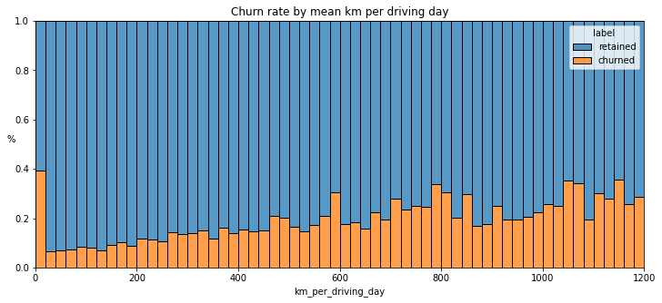
The churn rate tends to increase as the mean daily distance driven increases, confirming what was found in the previous course. It would be worth investigating further the reasons for long-distance users to discontinue using the app.
Create another histogram just like the previous one, only this time it should represent the churn rate for each number of driving days.
# Histogram
plt.figure(figsize=(12,5))
sns.histplot(data=df,
             x='driving_days',
             bins=range(1,32),
             hue='label',
             multiple='fill',
             discrete=True)
plt.ylabel('%', rotation=0)
plt.title('Churn rate per driving day');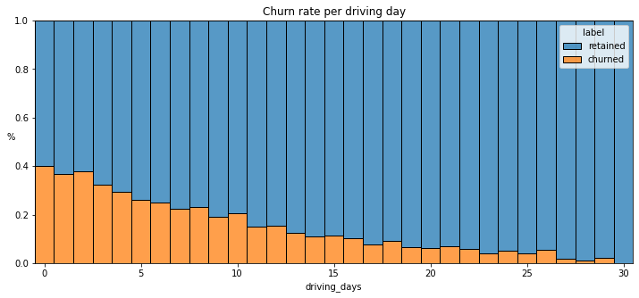
The churn rate is highest for people who didn’t use Waze much during the last month. The more times they used the app, the less likely they were to churn. While 40% of the users who didn’t use the app at all last month churned, nobody who used the app 30 days churned.
This isn’t surprising. If people who used the app a lot churned, it would likely indicate dissatisfaction. When people who don’t use the app churn, it might be the result of dissatisfaction in the past, or it might be indicative of a lesser need for a navigational app. Maybe they moved to a city with good public transportation and don’t need to drive anymore.
Create a new column percent_sessions_in_last_month that represents the percentage of each user’s total sessions that were logged in their last month of use.
df['percent_sessions_in_last_month'] = df['sessions'] / df['total_sessions']What is the median value of the new column?
df['percent_sessions_in_last_month'].median()0.42309702992763176Now, create a histogram depicting the distribution of values in this new column.
# Histogram
histogrammer('percent_sessions_in_last_month',
             hue=df['label'],
             multiple='layer',
             median_text=False)
Median: 0.4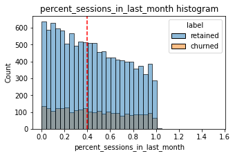
Check the median value of the n_days_after_onboarding variable.
df['n_days_after_onboarding'].median()1741.0Half of the people in the dataset had 40% or more of their sessions in just the last month, yet the overall median time since onboarding is almost five years.
Make a histogram of n_days_after_onboarding for just the people who had 40% or more of their total sessions in the last month.
# Histogram
data = df.loc[df['percent_sessions_in_last_month']>=0.4]
plt.figure(figsize=(5,3))
sns.histplot(x=data['n_days_after_onboarding'])
plt.title('Num. days after onboarding for users with >=40% sessions in last month');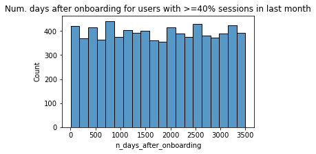
The number of days since onboarding for users with 40% or more of their total sessions occurring in just the last month is a uniform distribution. This is very strange. It’s worth asking Waze why so many long-time users suddenly used the app so much in the last month.
The box plots from the previous section indicated that many of these variables have outliers. These outliers do not seem to be data entry errors; they are present because of the right-skewed distributions.
Depending on what you’ll be doing with this data, it may be useful to impute outlying data with more reasonable values. One way of performing this imputation is to set a threshold based on a percentile of the distribution.
def outlier_imputer(column_name, percentile):
    # Calculate threshold
    threshold = df[column_name].quantile(percentile)
    # Impute threshold for values > than threshold
    df.loc[df[column_name] > threshold, column_name] = threshold

    print('{:>25} | percentile: {} | threshold: {}'.format(column_name, percentile, threshold))
Next, apply that function to the following columns: * sessions * drives * total_sessions * driven_km_drives * duration_minutes_drives
for column in ['sessions', 'drives', 'total_sessions',
               'driven_km_drives', 'duration_minutes_drives']:
               outlier_imputer(column, 0.95)
sessions | percentile: 0.95 | threshold: 243.0
drives | percentile: 0.95 | threshold: 201.0
total_sessions | percentile: 0.95 | threshold: 454.3632037399997
driven_km_drives | percentile: 0.95 | threshold: 8889.7942356
duration_minutes_drives | percentile: 0.95 | threshold: 4668.899348999999Call describe() to see if your change worked.
df.describe()| ID | sessions | drives | total_sessions | n_days_after_onboarding | total_navigations_fav1 | total_navigations_fav2 | driven_km_drives | duration_minutes_drives | activity_days | driving_days | km_per_driving_day | percent_sessions_in_last_month | |
|---|---|---|---|---|---|---|---|---|---|---|---|---|---|
| count | 14999.000000 | 14999.000000 | 14999.000000 | 14999.000000 | 14999.000000 | 14999.000000 | 14999.000000 | 14999.000000 | 14999.000000 | 14999.000000 | 14999.000000 | 14999.000000 | 14999.000000 |
| mean | 7499.000000 | 76.568705 | 64.058204 | 184.031320 | 1749.837789 | 121.605974 | 29.672512 | 3939.632764 | 1789.647426 | 15.537102 | 12.179879 | 578.963113 | 0.449255 |
| std | 4329.982679 | 67.297958 | 55.306924 | 118.600463 | 1008.513876 | 148.121544 | 45.394651 | 2216.041510 | 1222.705167 | 9.004655 | 7.824036 | 1030.094384 | 0.286919 |
| min | 0.000000 | 0.000000 | 0.000000 | 0.220211 | 4.000000 | 0.000000 | 0.000000 | 60.441250 | 18.282082 | 0.000000 | 0.000000 | 0.000000 | 0.000000 |
| 25% | 3749.500000 | 23.000000 | 20.000000 | 90.661156 | 878.000000 | 9.000000 | 0.000000 | 2212.600607 | 835.996260 | 8.000000 | 5.000000 | 136.238895 | 0.196221 |
| 50% | 7499.000000 | 56.000000 | 48.000000 | 159.568115 | 1741.000000 | 71.000000 | 9.000000 | 3493.858085 | 1478.249859 | 16.000000 | 12.000000 | 272.889272 | 0.423097 |
| 75% | 11248.500000 | 112.000000 | 93.000000 | 254.192341 | 2623.500000 | 178.000000 | 43.000000 | 5289.861262 | 2464.362632 | 23.000000 | 19.000000 | 558.686918 | 0.687216 |
| max | 14998.000000 | 243.000000 | 201.000000 | 454.363204 | 3500.000000 | 1236.000000 | 415.000000 | 8889.794236 | 4668.899349 | 31.000000 | 30.000000 | 15420.234110 | 1.530637 |
Analysis revealed that the overall churn rate is ~17%, and that this rate is consistent between iPhone users and Android users.
Perhaps you feel that the more deeply you explore the data, the more questions arise. This is not uncommon! In this case, it’s worth asking the Waze data team why so many users used the app so much in just the last month.
Also, EDA has revealed that users who drive very long distances on their driving days are more likely to churn, but users who drive more often are less likely to churn. The reason for this discrepancy is an opportunity for further investigation, and it would be something else to ask the Waze data team about.
I have learned ….
My other questions are ….
My client would likely want to know …
Use the following two code blocks (add more blocks if you like) to do additional EDA you feel is important based on the given scenario.
df['monthly_drives_per_session_ratio'] = (df['drives']/df['sessions'])df.head(10)| ID | label | sessions | drives | total_sessions | n_days_after_onboarding | total_navigations_fav1 | total_navigations_fav2 | driven_km_drives | duration_minutes_drives | activity_days | driving_days | device | km_per_driving_day | percent_sessions_in_last_month | monthly_drives_per_session_ratio | |
|---|---|---|---|---|---|---|---|---|---|---|---|---|---|---|---|---|
| 0 | 0 | retained | 243 | 201 | 296.748273 | 2276 | 208 | 0 | 2628.845068 | 1985.775061 | 28 | 19 | Android | 138.360267 | 0.953670 | 0.827160 |
| 1 | 1 | retained | 133 | 107 | 326.896596 | 1225 | 19 | 64 | 8889.794236 | 3160.472914 | 13 | 11 | iPhone | 1246.901868 | 0.406856 | 0.804511 |
| 2 | 2 | retained | 114 | 95 | 135.522926 | 2651 | 0 | 0 | 3059.148818 | 1610.735904 | 14 | 8 | Android | 382.393602 | 0.841186 | 0.833333 |
| 3 | 3 | retained | 49 | 40 | 67.589221 | 15 | 322 | 7 | 913.591123 | 587.196542 | 7 | 3 | iPhone | 304.530374 | 0.724968 | 0.816327 |
| 4 | 4 | retained | 84 | 68 | 168.247020 | 1562 | 166 | 5 | 3950.202008 | 1219.555924 | 27 | 18 | Android | 219.455667 | 0.499266 | 0.809524 |
| 5 | 5 | retained | 113 | 103 | 279.544437 | 2637 | 0 | 0 | 901.238699 | 439.101397 | 15 | 11 | iPhone | 81.930791 | 0.404229 | 0.911504 |
| 6 | 6 | retained | 3 | 2 | 236.725314 | 360 | 185 | 18 | 5249.172828 | 726.577205 | 28 | 23 | iPhone | 228.224906 | 0.012673 | 0.666667 |
| 7 | 7 | retained | 39 | 35 | 176.072845 | 2999 | 0 | 0 | 7892.052468 | 2466.981741 | 22 | 20 | iPhone | 394.602623 | 0.221499 | 0.897436 |
| 8 | 8 | retained | 57 | 46 | 183.532018 | 424 | 0 | 26 | 2651.709764 | 1594.342984 | 25 | 20 | Android | 132.585488 | 0.310573 | 0.807018 |
| 9 | 9 | churned | 84 | 68 | 244.802115 | 2997 | 72 | 0 | 6043.460295 | 2341.838528 | 7 | 3 | iPhone | 2014.486765 | 0.343134 | 0.809524 |
Now that you’ve explored and visualized your data, the next step is to share your findings with Harriet Hadzic, Waze’s Director of Data Analysis. Consider the following questions as you prepare to write your executive summary. Think about key points you may want to share with the team, and what information is most relevant to the user churn project.
Questions:
What types of distributions did you notice in the variables? What did this tell you about the data?
Nearly all the variables were either very right-skewed or uniformly distributed. For the right-skewed distributions, this means that most users had values in the lower end of the range for that variable. For the uniform distributions, this means that users were generally equally likely to have values anywhere within the range for that variable.
Was there anything that led you to believe the data was erroneous or problematic in any way?
Most of the data was not problematic, and there was no indication that any single variable was completely wrong. However, several variables had highly improbable or perhaps even impossible outlying values, such as
driven_km_drives. Some of the monthly variables also might be problematic, such asactivity_daysanddriving_days, because one has a max value of 31 while the other has a max value of 30, indicating that data collection might not have occurred in the same month for both of these variables.
Did your investigation give rise to further questions that you would like to explore or ask the Waze team about?
Yes. I’d want to ask the Waze data team to confirm that the monthly variables were collected during the same month, given the fact that some have max values of 30 days while others have 31 days. I’d also want to learn why so many long-time users suddenly started using the app so much in just the last month. Was there anything that changed in the last month that might prompt this kind of behavior?
What percentage of users churned and what percentage were retained?
Less than 18% of users churned, and ~82% were retained.
What factors correlated with user churn? How?
Distance driven per driving day had a positive correlation with user churn. The farther a user drove on each driving day, the more likely they were to churn. On the other hand, number of driving days had a negative correlation with churn. Users who drove more days of the last month were less likely to churn.
Did newer uses have greater representation in this dataset than users with longer tenure? How do you know?
No. Users of all tenures from brand new to ~10 years were relatively evenly represented in the data. This is borne out by the histogram for
n_days_after_onboarding, which reveals a uniform distribution for this variable.
Google Advanced Data Analytics (Coursera)